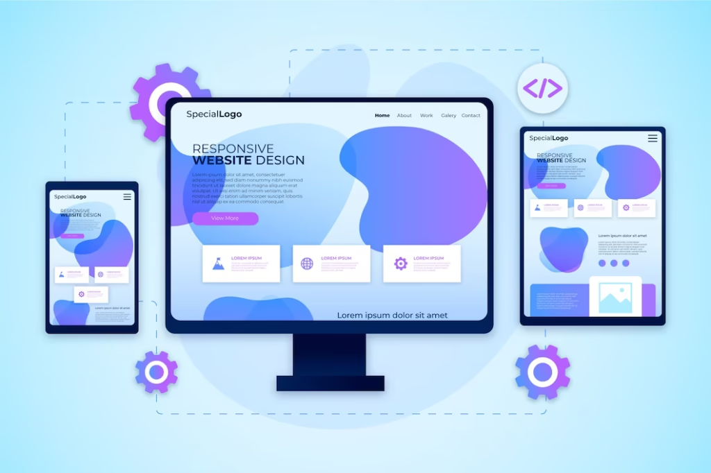
Here are the top 10 tips to keep your website responsive and user-friendly for every screen size:
1. Use a Mobile-First Design Process.
Use mobile screens as a starting point in your design. Mobile-first design means that all the most important features and content are put first, and the experience on smaller screens becomes seamless. After settling on a mobile layout, you can upsize to tablets and desktops.
2. Use a Flexible Grid Layout
A flexible grid enables the elements in your site to automatically customize the size of the device screen. It keeps text, images and other elements lined and attractive regardless of the resolution. This can be easily accomplished using most modern frameworks such as Bootstrap or CSS Grid.
3. Make images load faster.
Images with huge sizes and are not compressed can easily slow down a web site. Apply adaptive image sizes and relatively new formats such as WebP. Image compressors such as TinyPNG or ImageOptim can be used to compress images without reducing quality. Keep in mind, quick site means improved and faster user experience and higher positions in the search engine ranks.
4. Test on Multiple Devices and Browsers.
Use desktop testing alone. Always ensure that you have tested your website in various devices and browsers including iPhones, Android phones, tablets, and smart TVs. As a website designing company in Bangalore, Bitstreaks Technology recommends using tools like BrowserStack or Responsinator to ensure consistent performance.
5. Ensure Readable Typography
All devices should have readable and understandable text. Avoid using fixed font sizes. Rather, relative measurements such as em or rem to allow fonts to increase or decrease with screen size. A reactive typeface configuration will improve readability and general design stability.
6. Simplify Navigation Menus
Traditional navigation bars do not necessarily work on smaller screens. Hamburger menus or collapsible navigation should be used to keep the interface clean. Properly designed menu enhances usability and allows visitors to find what they need within a short time.
7. Give Emphasis to Touch-Friendly Elements.
Smartphone users use touch gestures. Ensure your buttons, links, and forms are large enough to avoid unintentional clicks. The elements should be spaced widely so that they can be easier to use and access.
8. Optimize Videos and Media
Videos embedded in it should be automatically resized to the screen. Embed codes or video containers should be responsive to any resolution. In addition, make other text and captions accessible.
9. Use Speed Optimization Techniques.
The speed of the page is imperative to retention. Cache, compress, and use Content Direction Networks (CDNs). As a website development company in Bangalore, Bitstreaks Technology emphasizes optimizing both front-end and back-end code to ensure lightning-fast performance.
10. Take advantage of WordPress Responsive Themes.
When using WordPress as a platform of your web site, you have to select a responsive theme that would fit various devices. Use it with potent addons such as Elementor or WP Rocket to get more flexibility in design and performance. Being a trusted WordPress website development company in Bangalore, Bitstreaks Technology ensures your WordPress sites are always optimized for responsiveness.
Final Thoughts
A responsive website isn’t just about aesthetics — it’s about delivering a seamless experience to every visitor, regardless of device or browser. At Bitstreaks Technology, we specialize in building mobile-friendly, high-performance websites that help brands grow online.
If you’re searching for a website designing company in Bangalore that understands the importance of responsive design, Bitstreaks Technology is your go-to partner. Our team of skilled developers and designers ensures that your website not only looks stunning but also performs flawlessly on every device.
Get in touch with Bitstreaks Technology today — the most reliable website development company in Bangalore — and make your digital presence stronger, faster, and more responsive than ever!